Copyright: Public domain
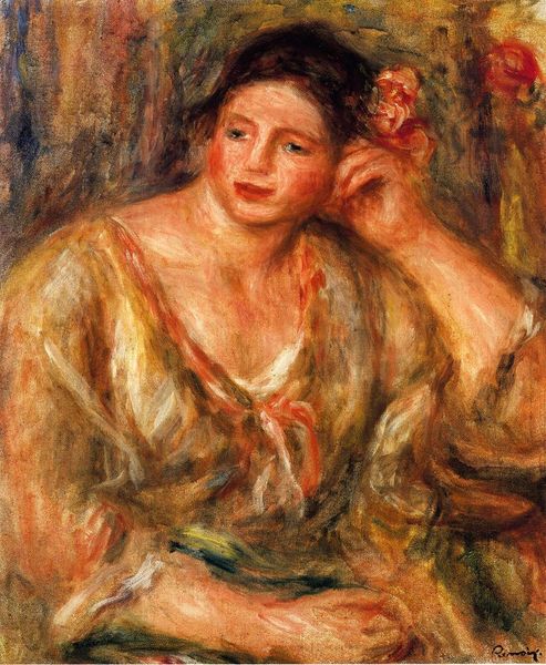
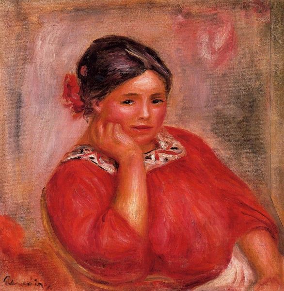
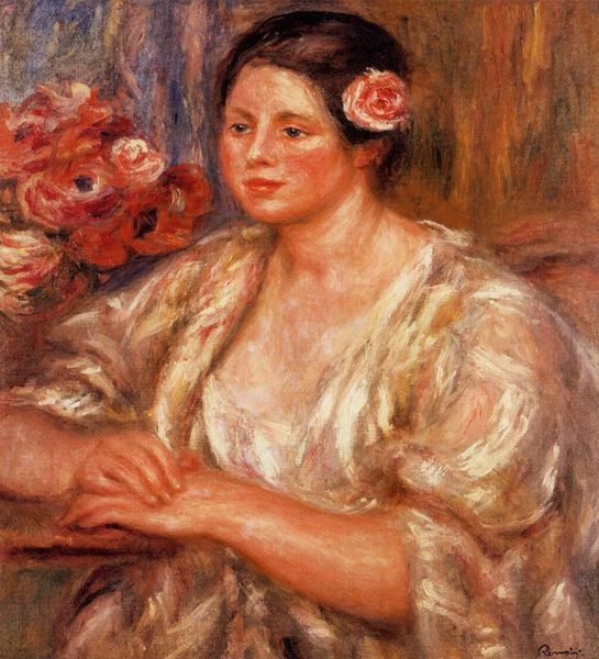
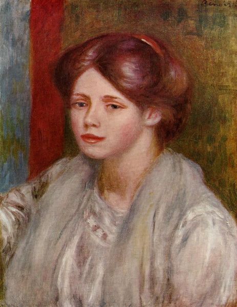
Editor: Here we have Renoir’s "Vera Sertine Renoir," painted in 1914. It’s an oil on canvas. I’m immediately struck by the softness of the colors and brushstrokes; it gives the portrait an almost dreamlike quality. What do you see in this piece? Curator: The chromatic relationships are certainly of primary importance. Observe how Renoir employs a limited palette, primarily variations of red, yellow, and white, yet achieves a remarkable vibrancy. Notice especially how the red of the flower in her hair echoes, though it's not quite identical to, the drapery below. What effect does that choice produce, do you think? Editor: It brings cohesion. I can see how that repetition connects the figure to the space surrounding her. The redness leads your eye from the flower downward, making the entire image feel like a unit, rather than separate components. Curator: Precisely. Renoir meticulously balances areas of high and low chroma. The diffused background avoids any sharp delineations, ensuring the focus remains on Vera’s expression. Consider also the directionality of the brushstrokes – short, broken touches which capture light and create texture without relying on detailed linear description. Are there any other examples of compositional tactics you've observed in the work? Editor: Well, her gaze directs you, and that, plus the hand on her face and slight turn of her head make the overall composition quite active even though she seems pretty still. Curator: It's a successful method for imbuing vitality into what might otherwise be a static portrayal. By examining these formal elements – color, composition, brushwork – we can understand how Renoir constructs a compelling and aesthetically resolved portrait. Editor: I'm starting to see how much consideration is put into making it not only look soft, but make your eyes move through it and back again. Thank you.
Comments
No comments
Be the first to comment and join the conversation on the ultimate creative platform.