drawing, paper, ink, pen
#
drawing
#
hand-lettering
#
hand drawn type
#
hand lettering
#
paper
#
personal sketchbook
#
ink
#
ink drawing experimentation
#
pen-ink sketch
#
pen work
#
sketchbook drawing
#
pen
#
storyboard and sketchbook work
#
sketchbook art
Copyright: Rijks Museum: Open Domain
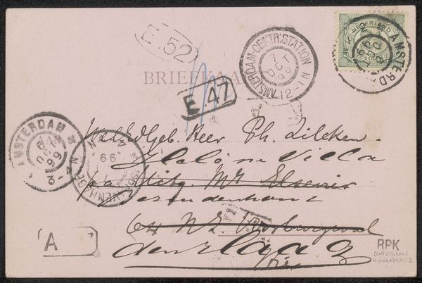
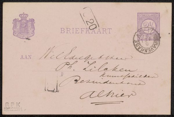
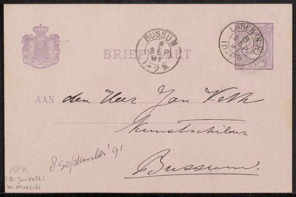
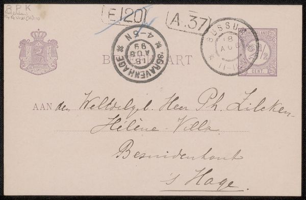
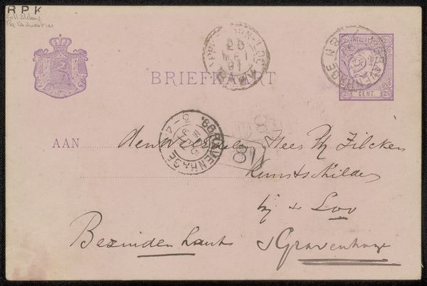
Editor: We’re looking at a drawing entitled "Briefkaart aan Philip Zilcken," made before 1895, it appears to be ink on paper. I am really drawn to the range of textures and lines. What stands out to you when you look at this artwork? Curator: Immediately, the semiotic density is remarkable. Observe how the various layers of script interweave, creating a textured plane. The contrast between the rigid postal markings and the cursive address generates a tension, doesn't it? What do you make of that visual dichotomy? Editor: I hadn’t considered it like that, but I see what you mean. The rigid stamp feels almost like a formal interruption to the flow of the handwriting. Curator: Precisely. And the washes of ink, particularly surrounding the postal marks, evidence a manipulation of the medium. This application affects the visual weight and our reading of depth on an otherwise flat surface. The artist seems very interested in playing with dimension. Editor: Yes, that contrast adds complexity. So you’re seeing the process, the layers, the very materiality of the piece, as carrying meaning. Curator: Indeed. It’s a complex system of marks, where each element—the line quality, the placement, the superimposition—contributes to its formal identity. One may ask, what does the layering reveal about the artistic practice? Editor: Thinking about it now, I'm more aware of how each element contributes to the overall design. Curator: Exactly, it’s about decoding the visual syntax, a lesson in learning about design from historical and contemporary sources.
Comments
No comments
Be the first to comment and join the conversation on the ultimate creative platform.
More like this