graphic-art, lithograph, print, typography
graphic-art
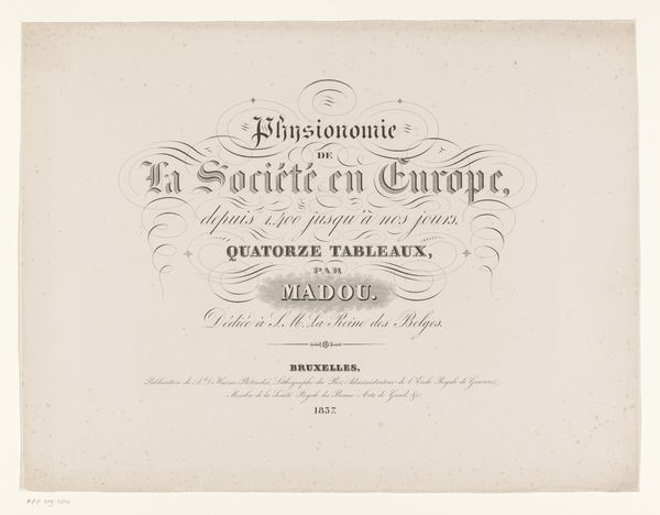
script typography
hand-lettering
lithograph
typeface
hand drawn type
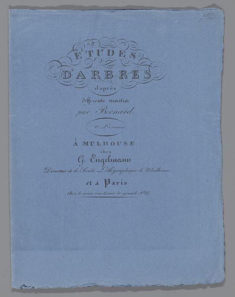
landscape
typography
typography
hand-drawn typeface
fading type
romanticism
stylized text
thick font
typography style
calligraphy
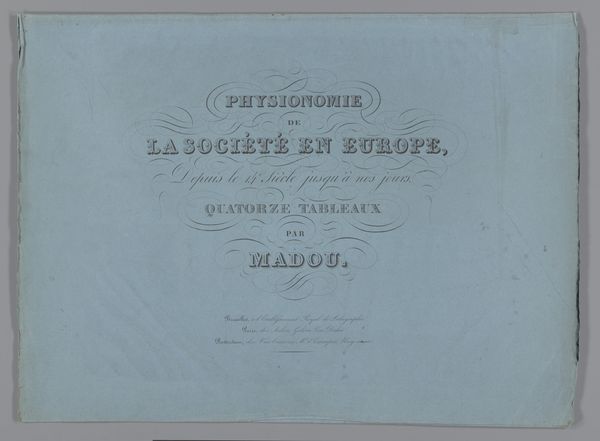
Dimensions: height 368 mm, width 277 mm
Copyright: Rijks Museum: Open Domain
Curator: This intriguing cover, "Omslag voor: Landschapsstudies" from 1831, is a lithograph by Jules Coignet. There's an elegant restraint to its design. Editor: Indeed. The first thing that strikes me is the ethereal quality—it feels almost weightless, the pale blue background lending a softness to the stylized text. Curator: As a lithograph, we need to consider the labour involved, the physical processes. Each impression demanded careful work to transfer the design, revealing printmaking's own distinct hand, its own mark in making images widely accessible. Editor: The formal arrangement creates a subtle rhythm. Notice how the typography itself becomes the art. The cascading, almost handwritten quality invites us into the 'Landscape Studies' that lie within. There’s also a sense of depth created through the variation in font weight and size. Curator: And consider the market it's engaging. The means of producing these landscape studies hints at broader questions. Was it meant for art students? Affluent amateurs? The cover acts as an interface, suggesting the type of learning—and labor—inside. Editor: Perhaps, but the balanced asymmetry creates a visual harmony. The delicate curves and serifs evoke a sense of Romanticism. The layout emphasizes structure in a way that complements the calligraphic flourishes. Curator: Looking at lithography within social practice helps consider what Coignet does. It provided, then, new possibilities to reach a wide array of people involved in visualizing and studying the environment, blurring social stratification within artistic instruction. Editor: So, beyond its context as a learning tool, do you find that the artistic design still holds relevance and appeal, irrespective of its production details? Curator: Both facets remain inseparable, actually. Editor: Interesting perspective. Its visual construction, balanced with our engagement with historical processes, can make for an enduring work, I’ll concede that point.
Comments
No comments
Be the first to comment and join the conversation on the ultimate creative platform.
More like this